new business cards
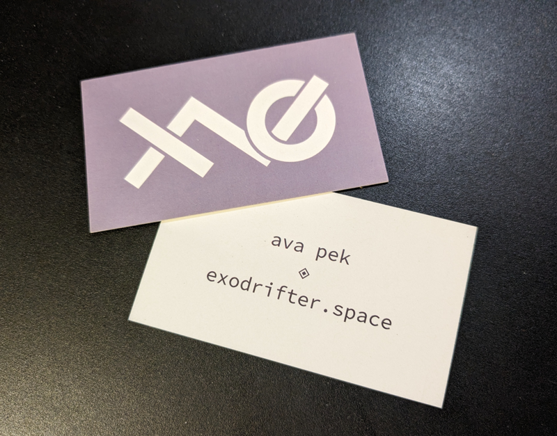
I updated my logo quite some time ago, and I hadn't gotten new business cards to replace my old ones until now. I'm going to hand these out at in-person playtests and at meetups!
When I first adopted my current username, I wanted to create a logo that used deconstructed elements of my username. One of the considerations I made when choosing my username is that I wanted to have a short way of representing it:
xo: represents "exo", but also "hugs and kisses" (I'm secretly quite affectionate)~, like a squiggly line that wanders here and there, it represents "drifter" (in my formative years, I never felt like part of a group and I tended to drift between cliques)
So xo~ means my username,
exodrifter. The logo design I
subsequently came up with in 2017 looked like
this:
The logo was a really awkward shape; I found it difficult to incorporate it on my website, place it along with other graphical elements, and make it legible when scaled down to fit in a small icon. It felt a bit like a boot spur made out of thin wire that was hard to see and poked into everything around it. It's also not entirely clear where the various deconstructed elements went. It used to be clear to me and ambiguous enough that I liked it -- but then I forgot, so I guess it was too ambiguous. I can't explain it to you consistently even if you asked me now. At least the tilde seems obvious. 😅
It wasn't until last year the year
before last (in 2022) that I finally decided to
update the logo to this:
I like this design better. The form is more
compact and legible, and it incorporates one
additional meaning: the forward diagonal stem of the
x is re-used to make up the first part
of the tilde, which leaves the backward diagonal
stem of the x as a unique element in
the logo. This can be read together with the
o to denote a 1 and
0 respectively, representing binary.
You know, because I'm a software developer.
HACKING IN
PROGRESS
You might also notice the particular color
choice. It's not particularly colorful, but it has a
meaning too. I'll leave it up to you to decode what
that means, if you'd like (the hex color code for it
is #786f7e).